Red Panda Boba
A rebrand.
-
The first step of the design process was getting acquainted with the business and identifying the design problem.
In this case, the business did not have a brand identity. Cups were branded with the manufacturer’s logo, and the awning identifying the business was obstructed by a large tree. Numerous reviews revealed that the business is overlooked due to its’ neglected storefront.
The next step was conducting market research. This involved analyzing census data for market segmentation.
Then, four personas were created in order to select primary and secondary target audiences. Finally, a SWOT analysis was conducted.
-
The goal was to create an impactful bubble tea logo. Bubble tea is a fun product. With nearly one hundred flavours to choose from, a variety of toppings such as mango star shaped jelly, strawberry popping boba and more, customers can create the perfect drink for themselves.
A playful brand personality matches the nature of the product, and the five dollar price tag. With this in mind, the decision to create a likable character to represent the brand was made.
The character would be based on a rare and striking animal: the red panda. Red pandas symbolize gentleness, patience, and wisdom. They are cute, playful, and docile.
The primary target audience is high school students. There is a large secondary school across the street from the business, and bubble tea is very popular with their generation.
-
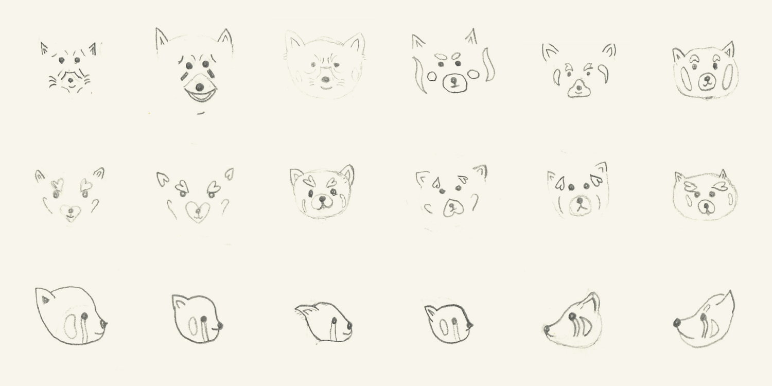
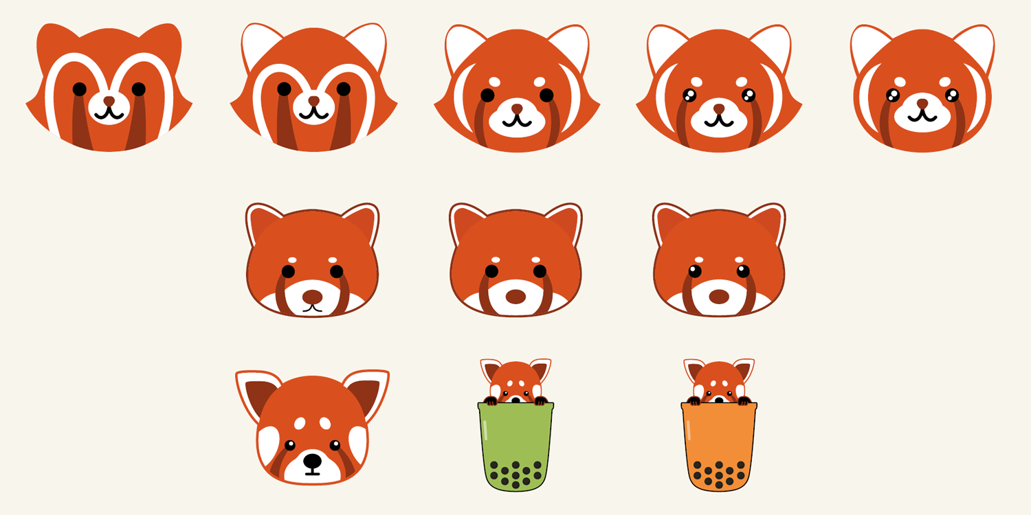
Sketches of red pandas were done on paper. Then, iterations were created in Illustrator. After receiving feedback, the panda’s expression was changed, its eyes were enlarged, and the colour palette was refined.
-
The final design would be used for branded cups, sealer film, window decals, sandwich boards and menus.
Check out the style guide I created here.
The symmetry and simplicity of this illustration creates balance and stability, opening the door for feelings of trust and reliability.

The colour palette corresponds with the colouring of a real red panda, ensuring recognition and familiarity.

The font Ohno Softie was chosen because it has a playful aesthetic. The rounded corners are friendly, and reminiscent of tapioca.
Primary Palette

Hex: 8e3216
C: 28%
M: 88%
Y: 100%
K: 29%
R: 142
G: 50
B: 22

Hex: d9501e
C: 10%
M: 82%
Y: 100%
K: 2%
R: 217
G: 80
B: 30
Secondary Palette

Hex: 9ebf56
C: 43%
M: 8%
Y: 86%
K: 0%
R: 158
G: 191
B: 86

Hex: 00000
C: 100%
M: 100%
Y: 100%
K: 100%
R: 0
G: 0
B: 0

Hex: ffffff
C: 0%
M: 0%
Y: 0%
K: 0%
R: 255
G: 255
B: 255
Accent Colour

Hex: f2b338
C: 4%
M: 31%
Y: 91%
K: 0%
R: 242
G: 180
B: 56


